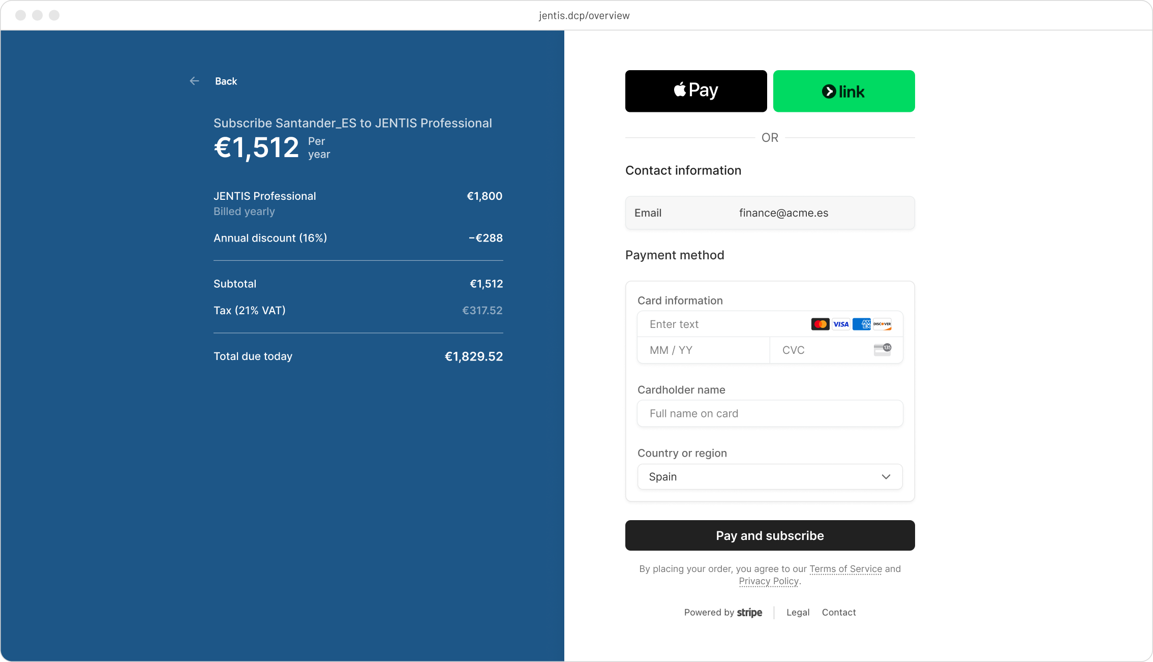
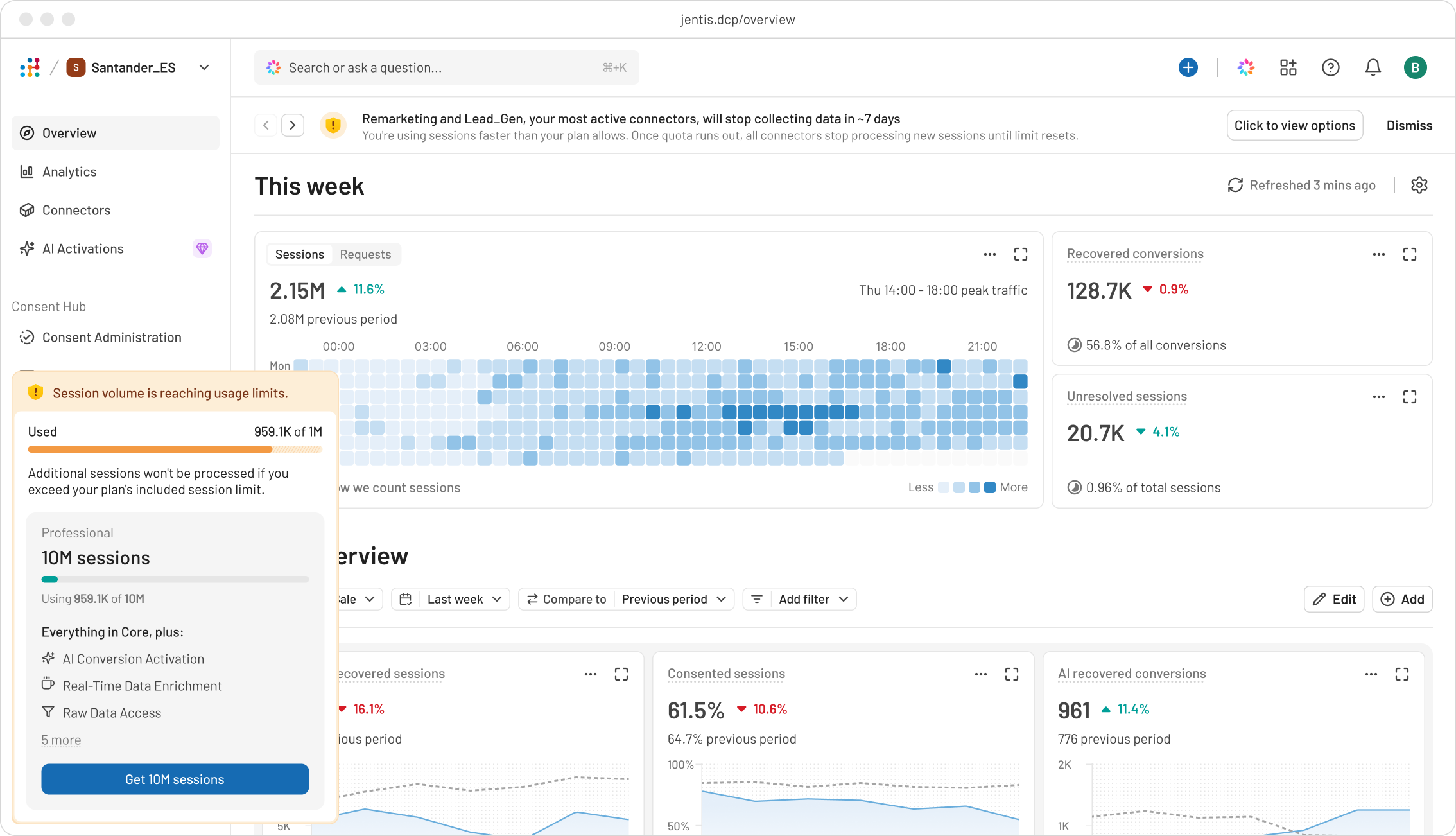
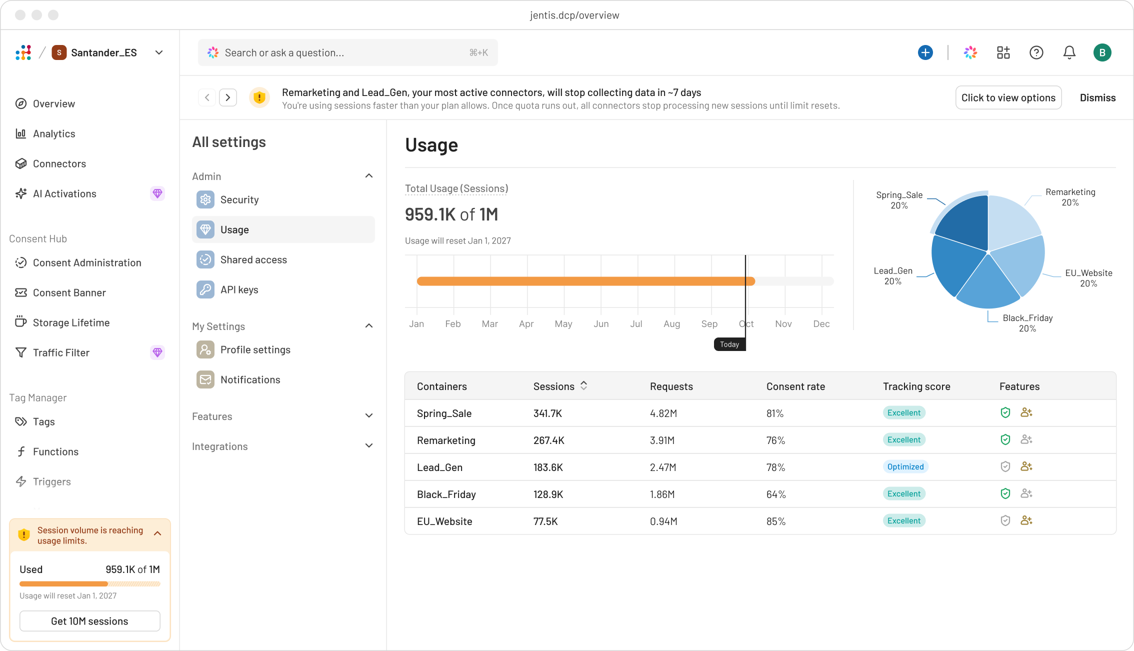
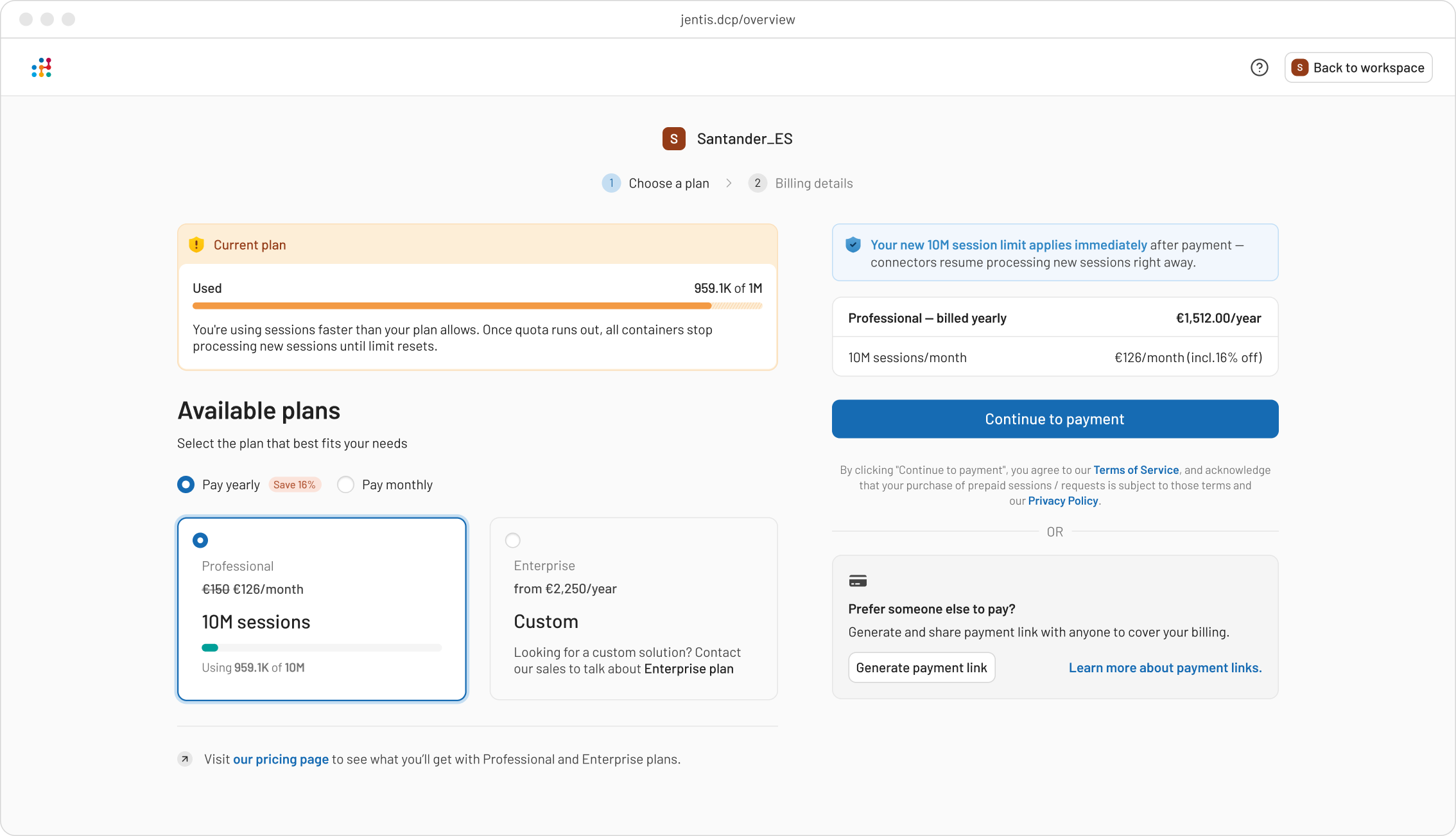
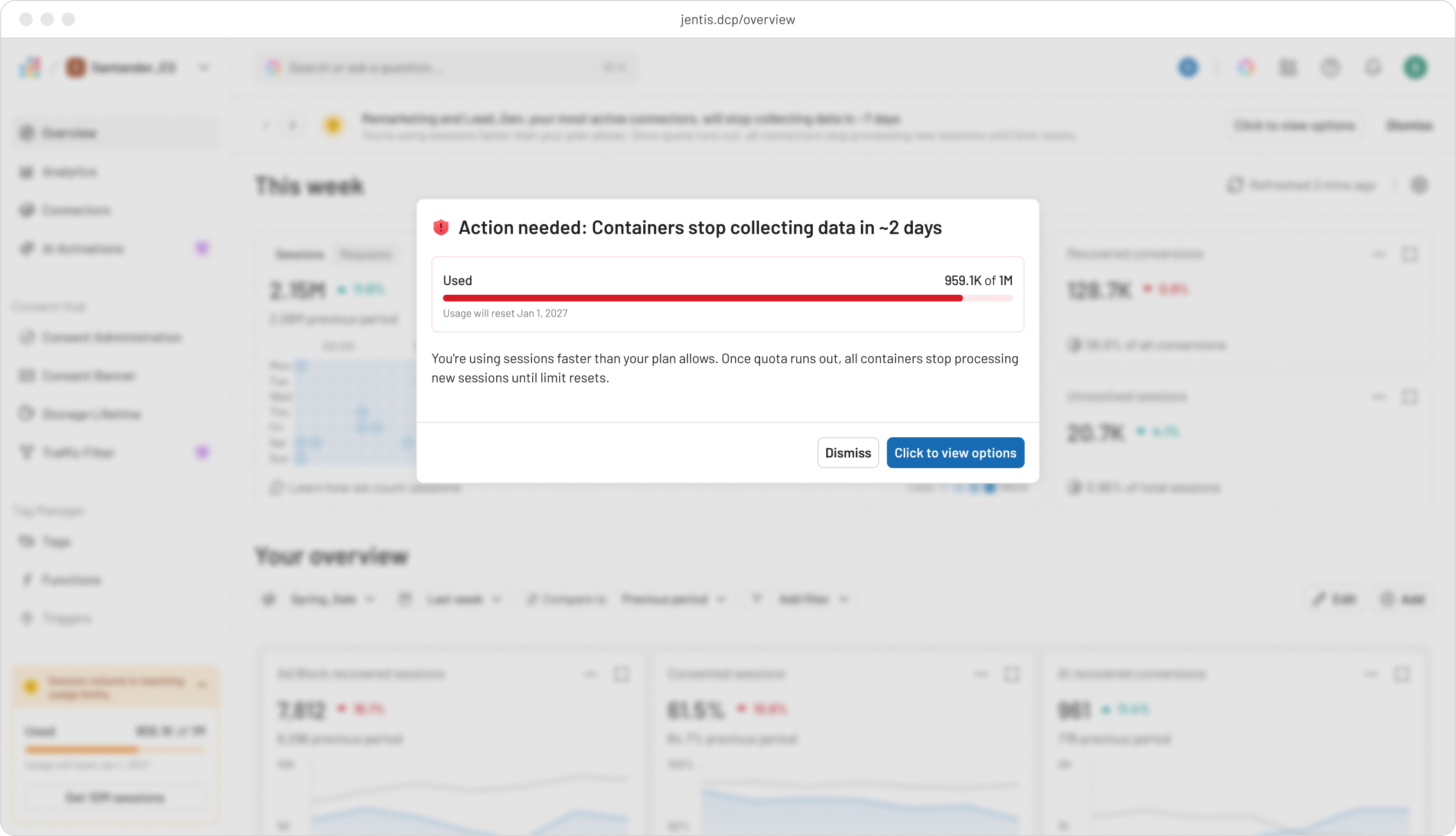
Reducing Upgrade Drop-Off
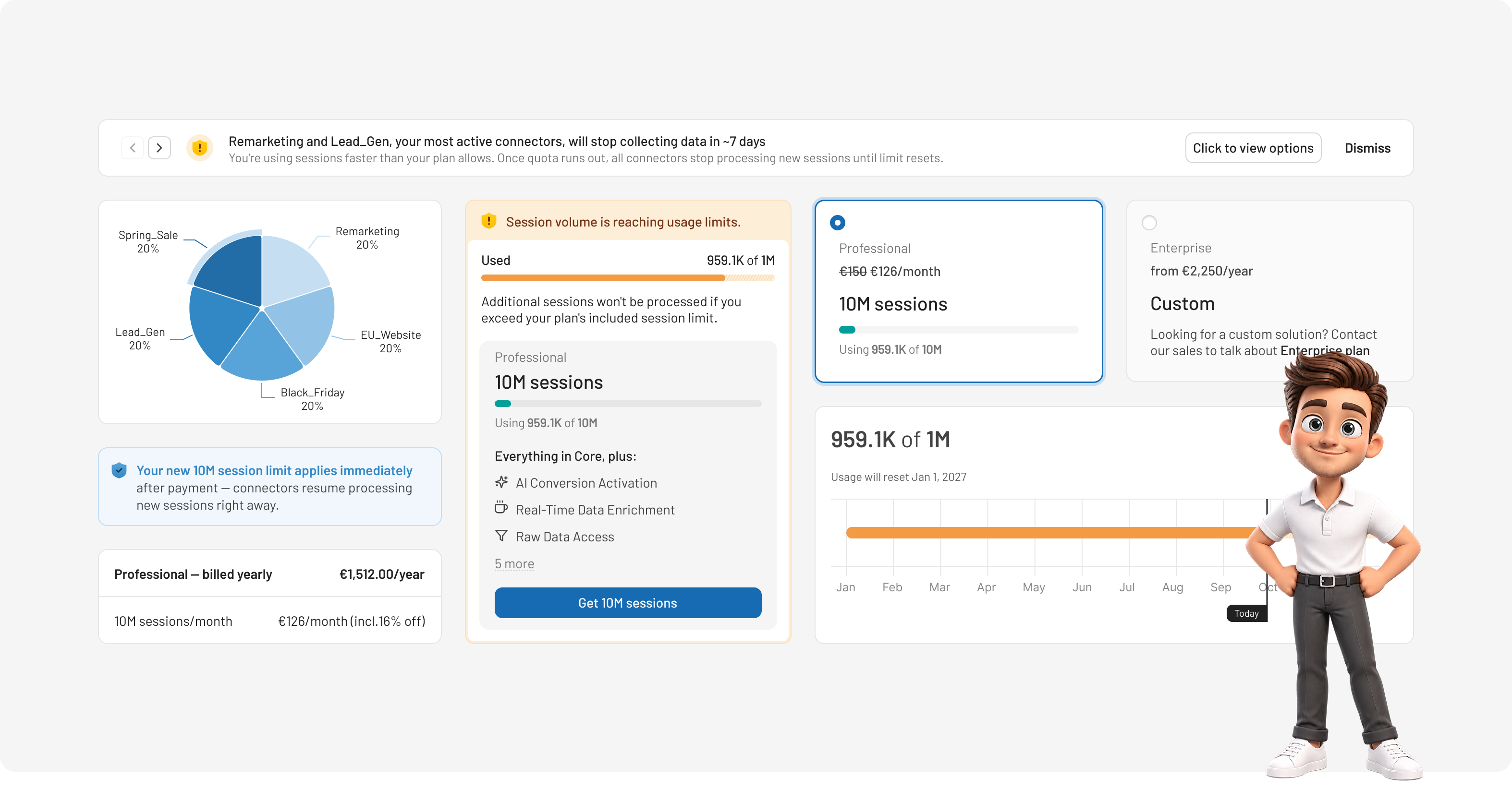
Led the end-to-end redesign of the upgrade flow—from drop-off diagnosis and alert strategy to checkout and pricing clarity—turning a leaky funnel into a clear, trustworthy upgrade experience.

In this project we've replaced a traditional Figma-first workflow with an AI-native workflow, using Claude Design as the primary design environment throughout every design phase and handoff.
The main objective was to understand why users intended to upgrade to higher plan but failed to complete the upgrade, and find opportunities to improve existing upgrade experience.
To get there, I investigated where friction occurs across the funnel, what triggers upgrade intent, what blocks action in the moment, and how competitors handle the same problem.
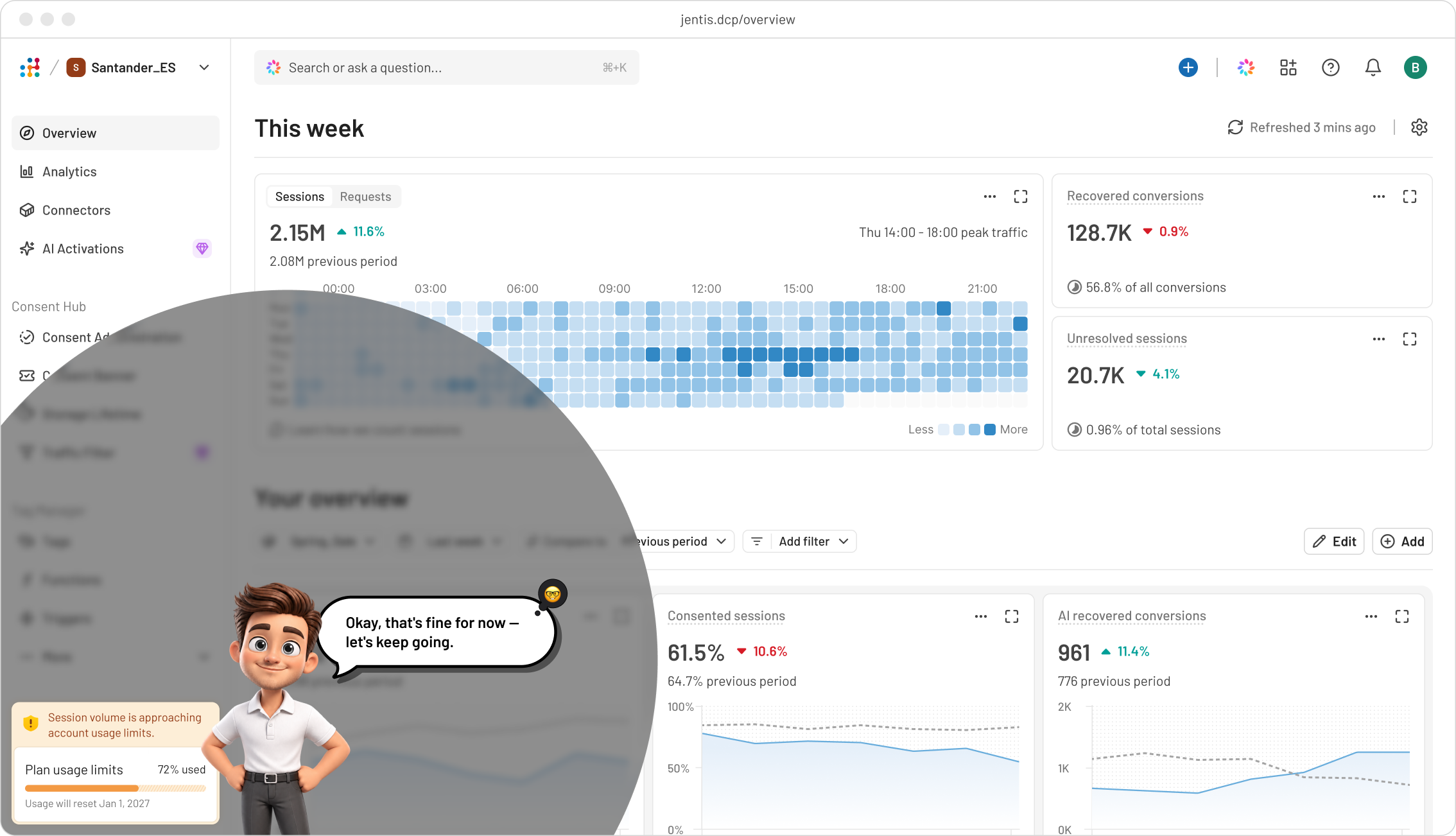
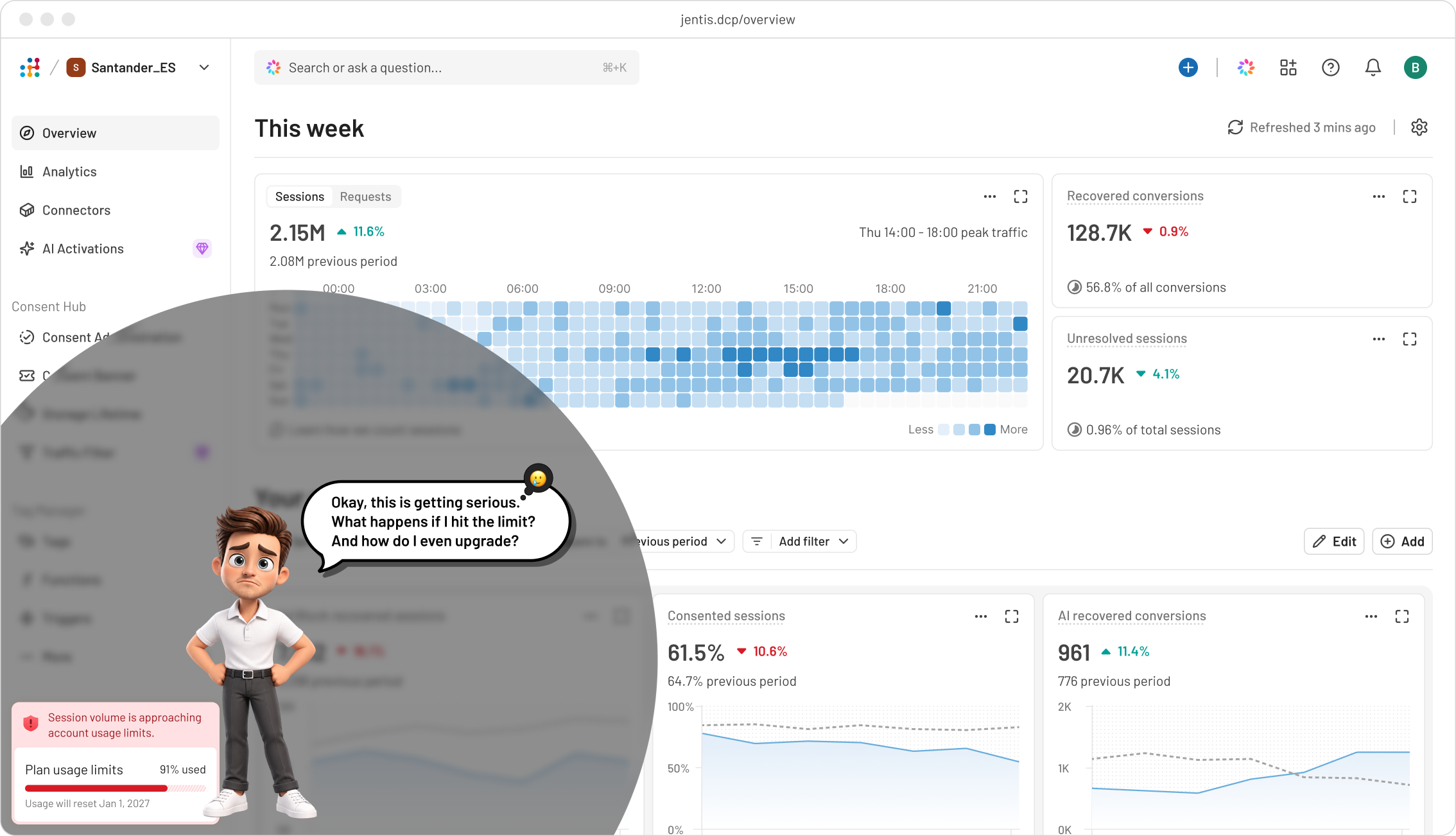
I solved it by reframing the problem from "make the upgrade button visible" to redesigning the full path — from how the alert communicates urgency, to how easily that urgency can be acted on and handed off.
Research synthesis
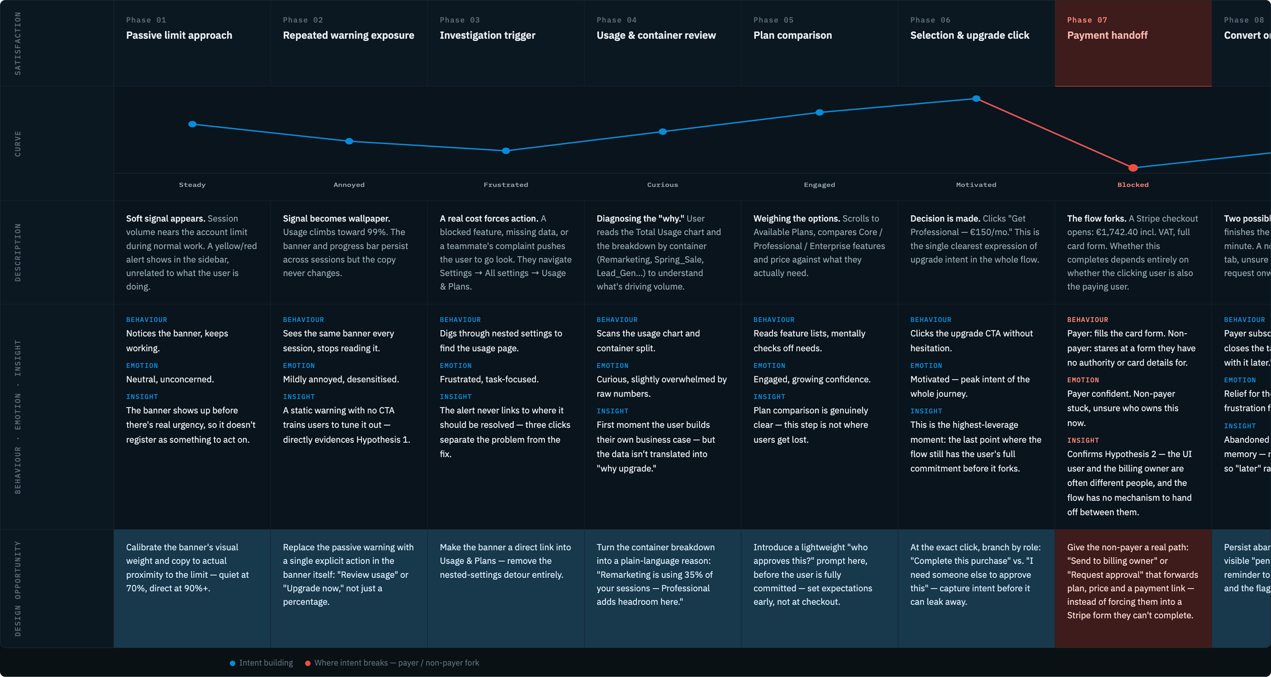
Secondary research showed that users don't fail to upgrade because they don't want higher plan. They fail when intent appears but the path to upgrade and its experience is unclear.
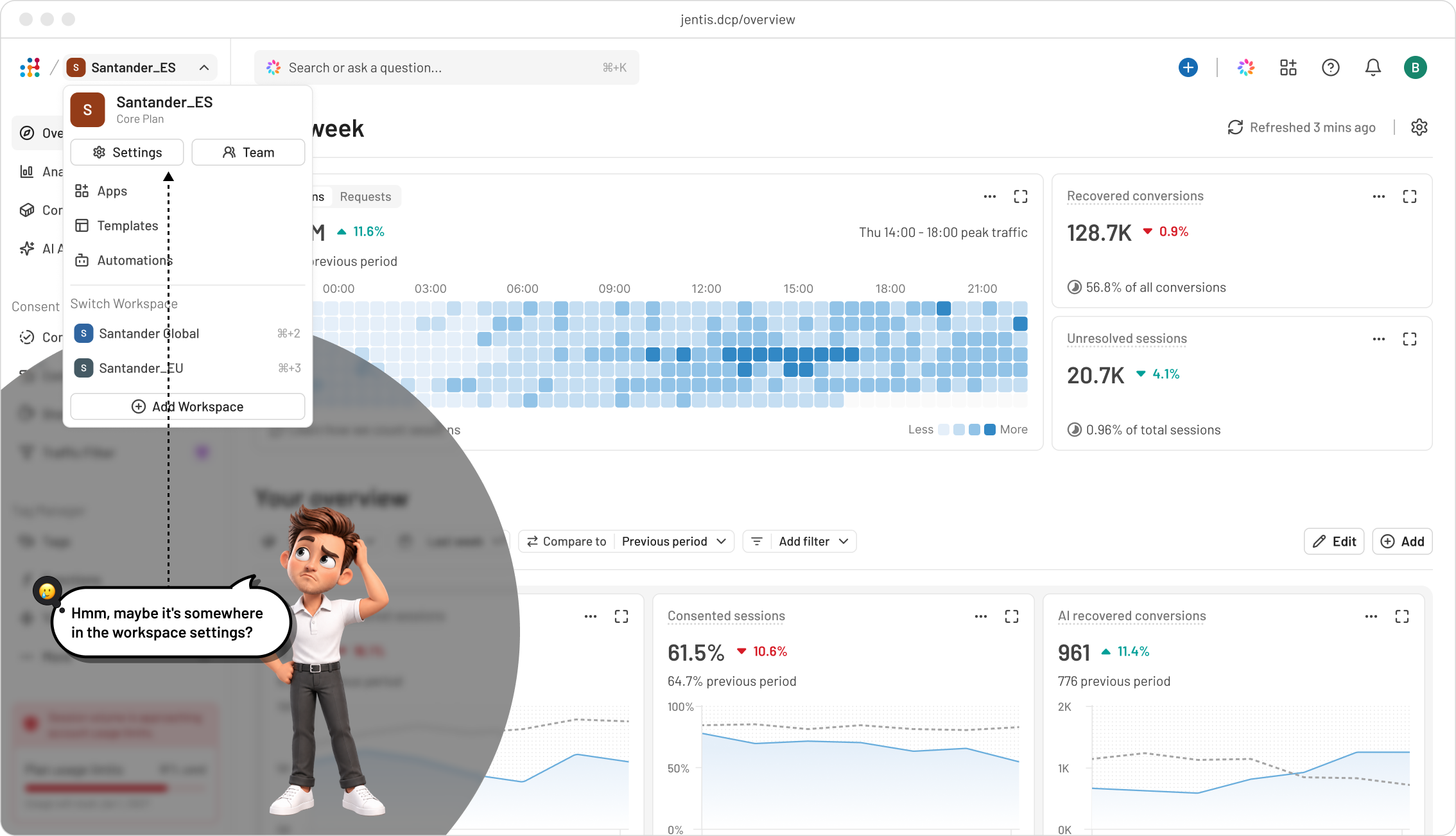
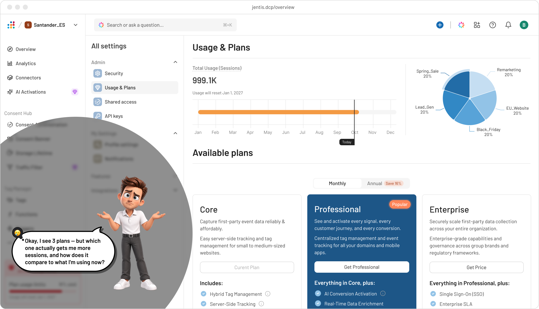
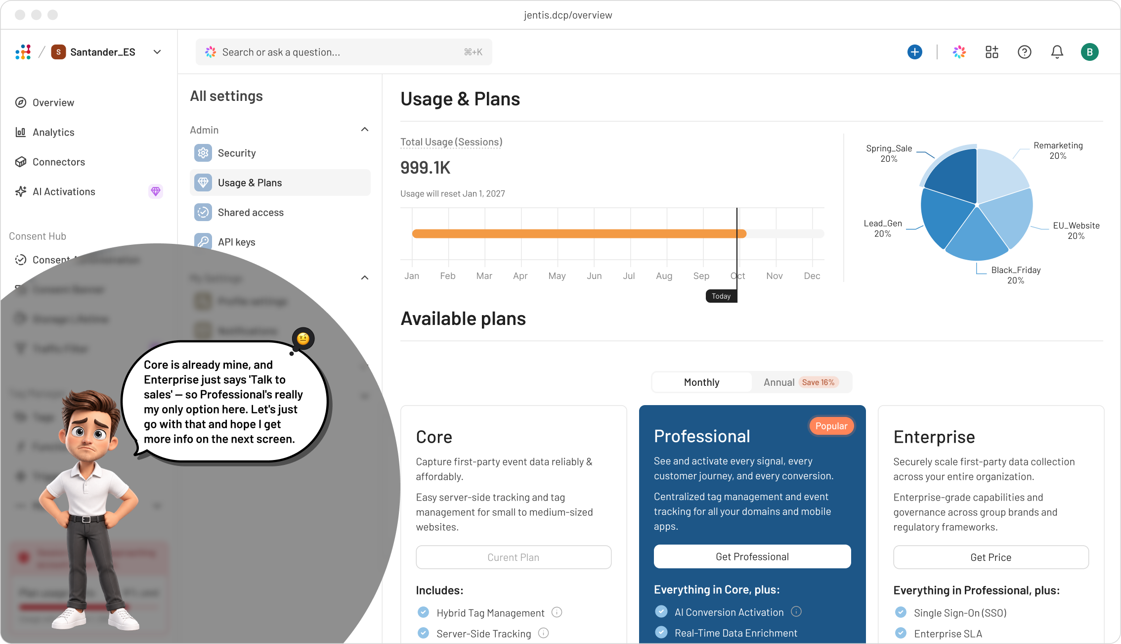
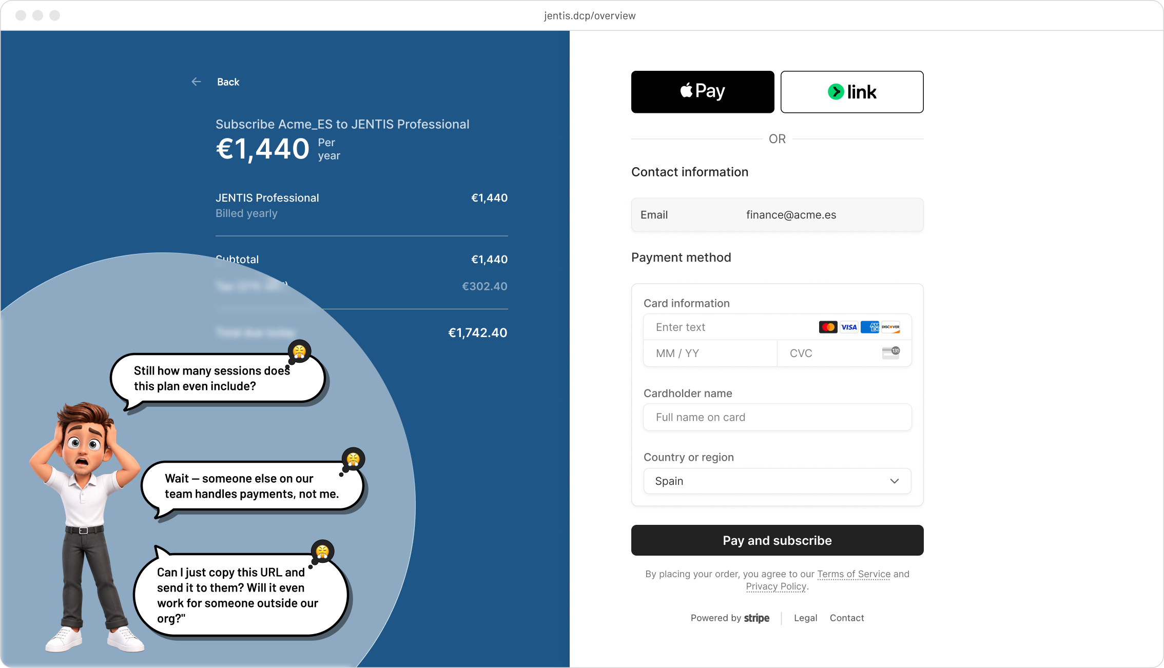
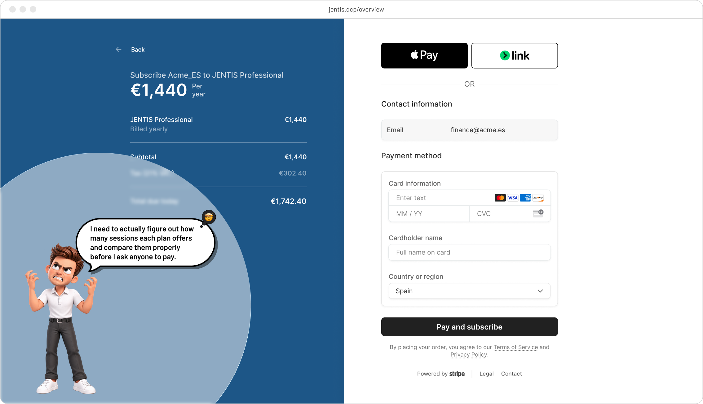
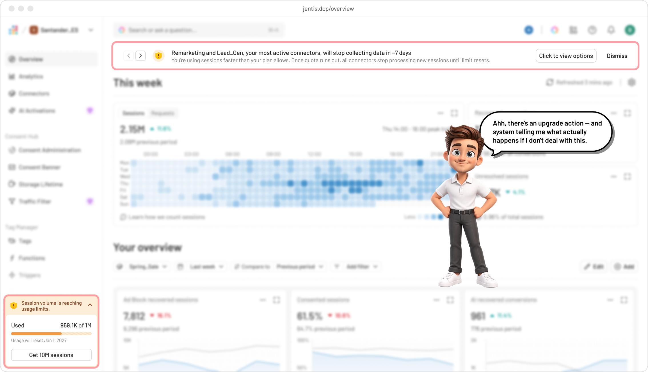
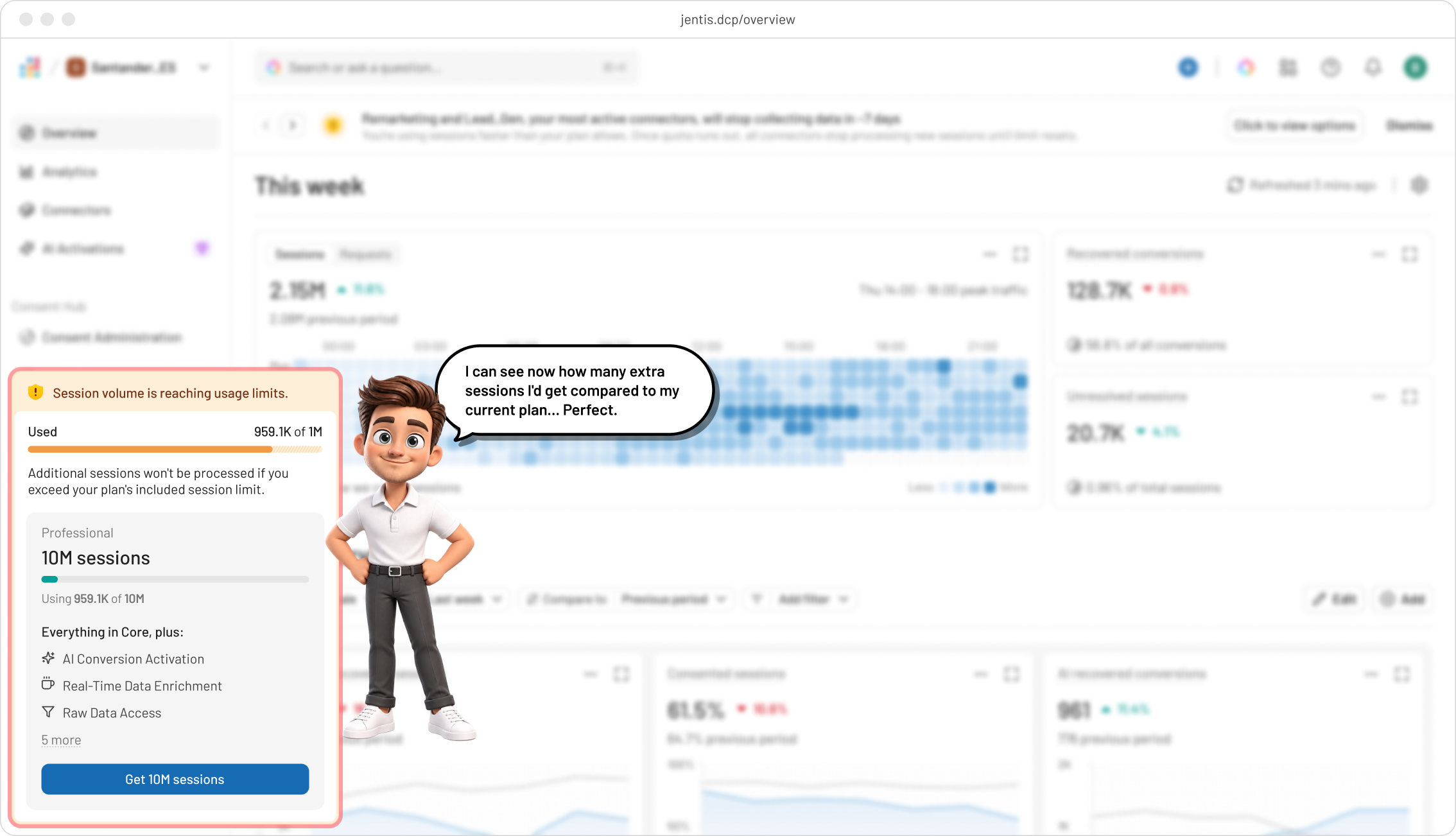
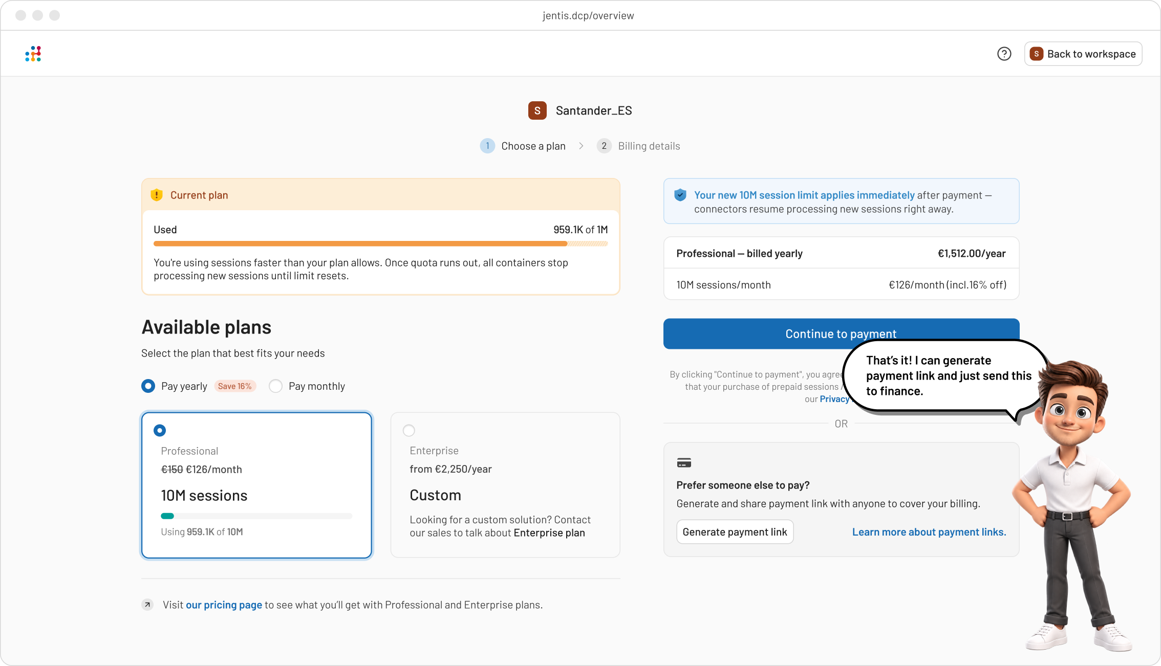
Walking through what the user is thinking and feeling at each step of the upgrade flow.