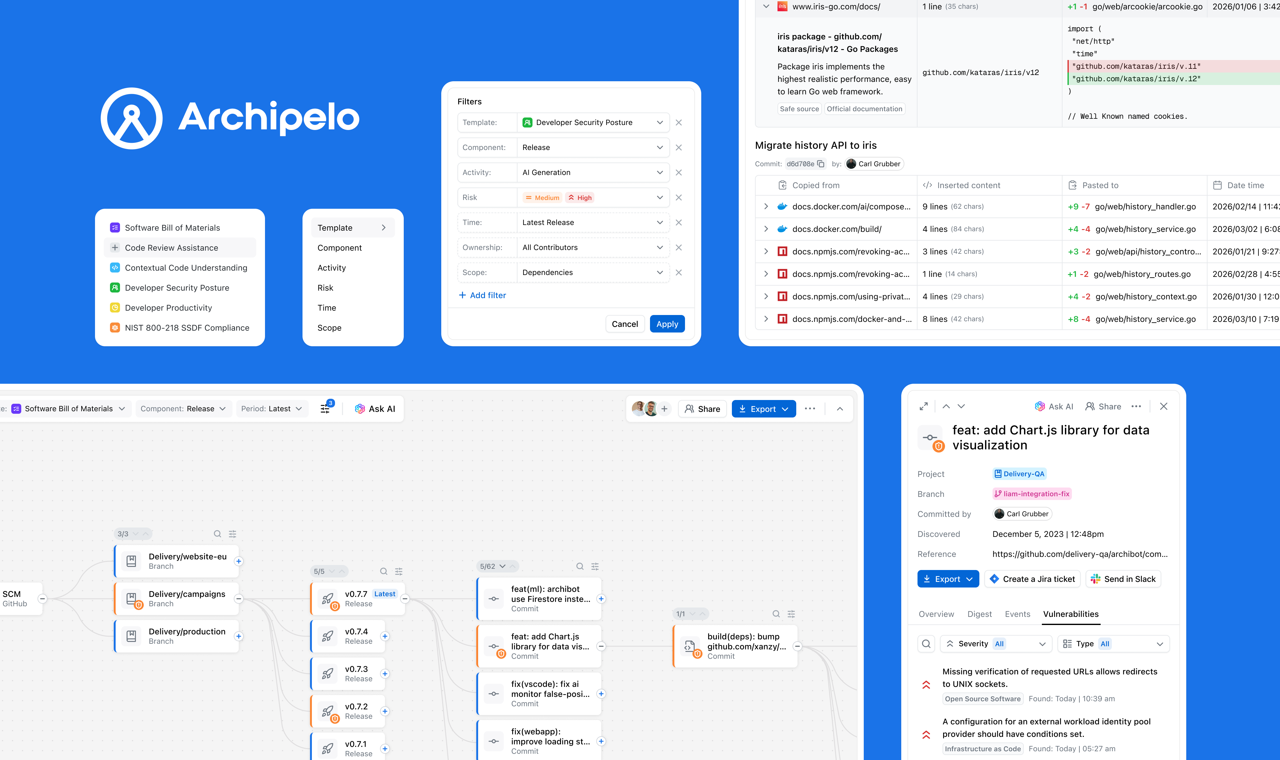
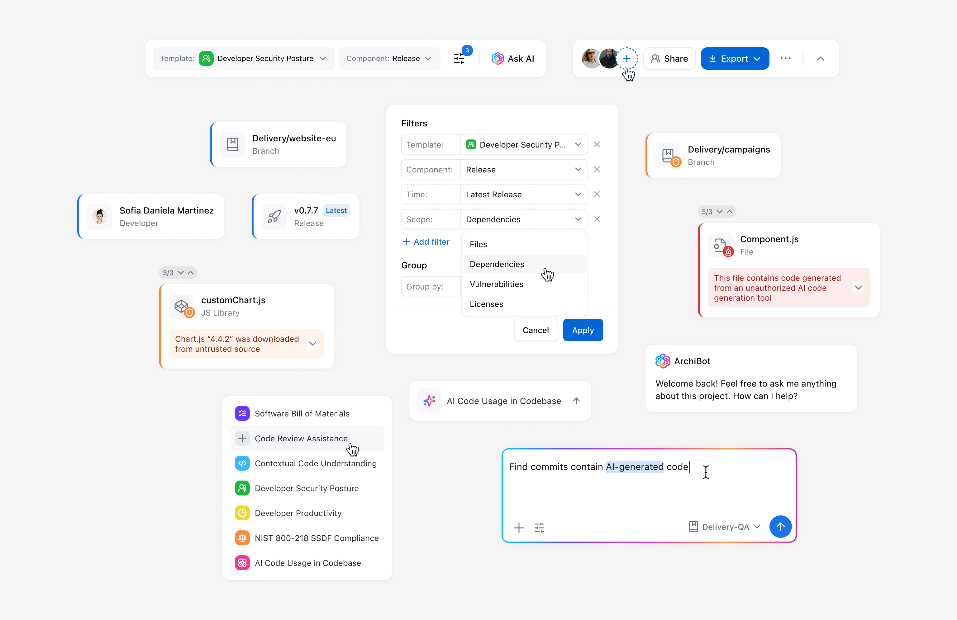
Archipelo is an observability layer for software creation, where understanding security issues and their origin requires historical context. The Graph links security findings to prior code changes, developer actions, and events in a time-sequenced view.
www.archipelo.comLed the end-to-end design of the Graph feature, from research and concept through UX flows, testing, and final UI and interactions.
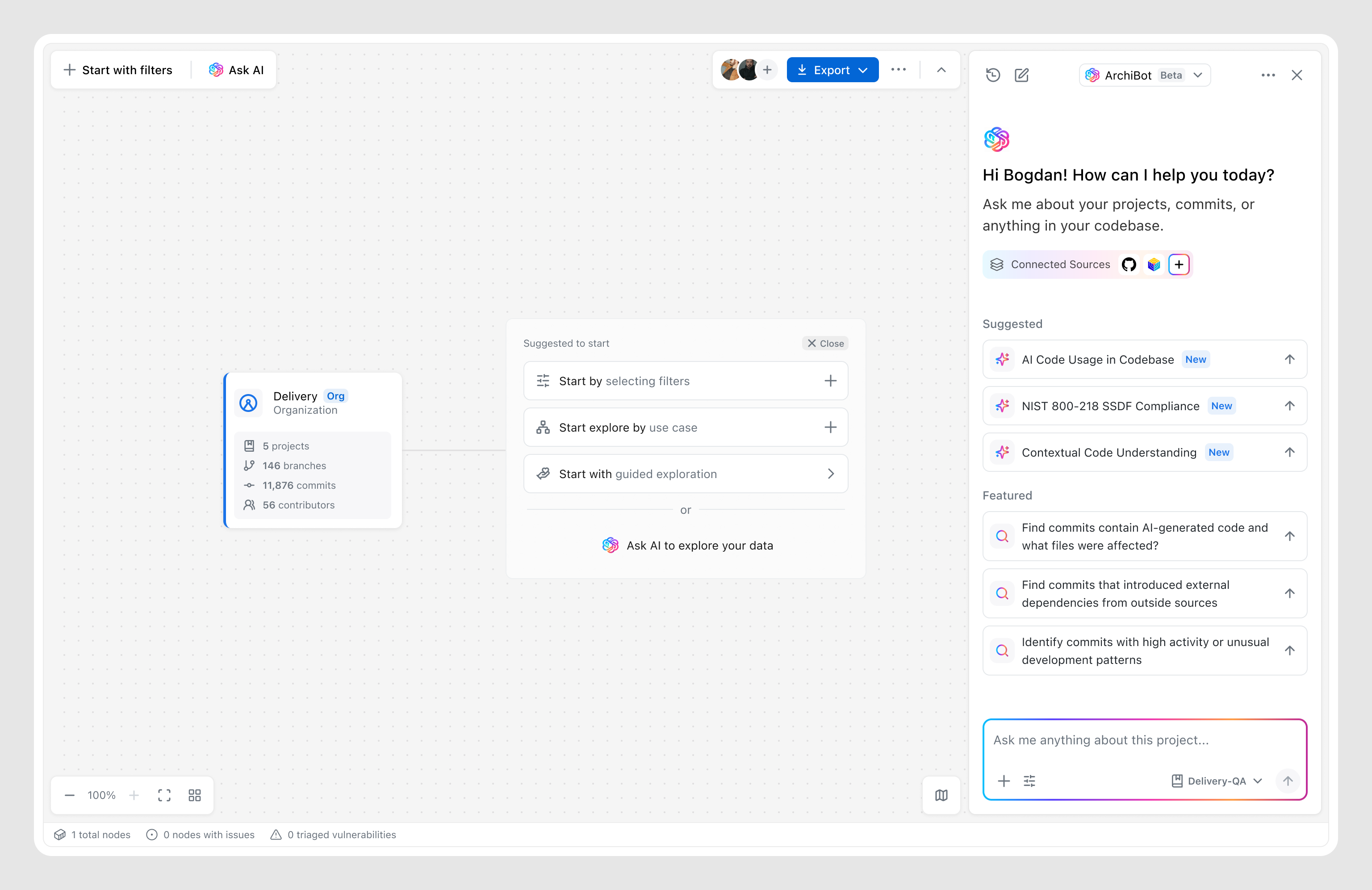
An investigation experience visualizing relationships between code changes, developer actions, and security events, with filtering, insights, and integrated AI.
Collaborated closely with engineers, product managers, and security specialists to shape the feature and ensure alignment.
Modern software development creates a complex web of code changes, developer actions, and automated processes, making it hard to understand how security issues arise. When vulnerabilities are detected, teams often lack the context needed to trace them back to their origin, such as a specific change or development action.
The challenge set in front of me was to find the most effective way to make complex development data understandable and explorable, while determining how existing features—such as Reports, Insights, and the AI assistant—should be integrated into the overall experience and user flows.
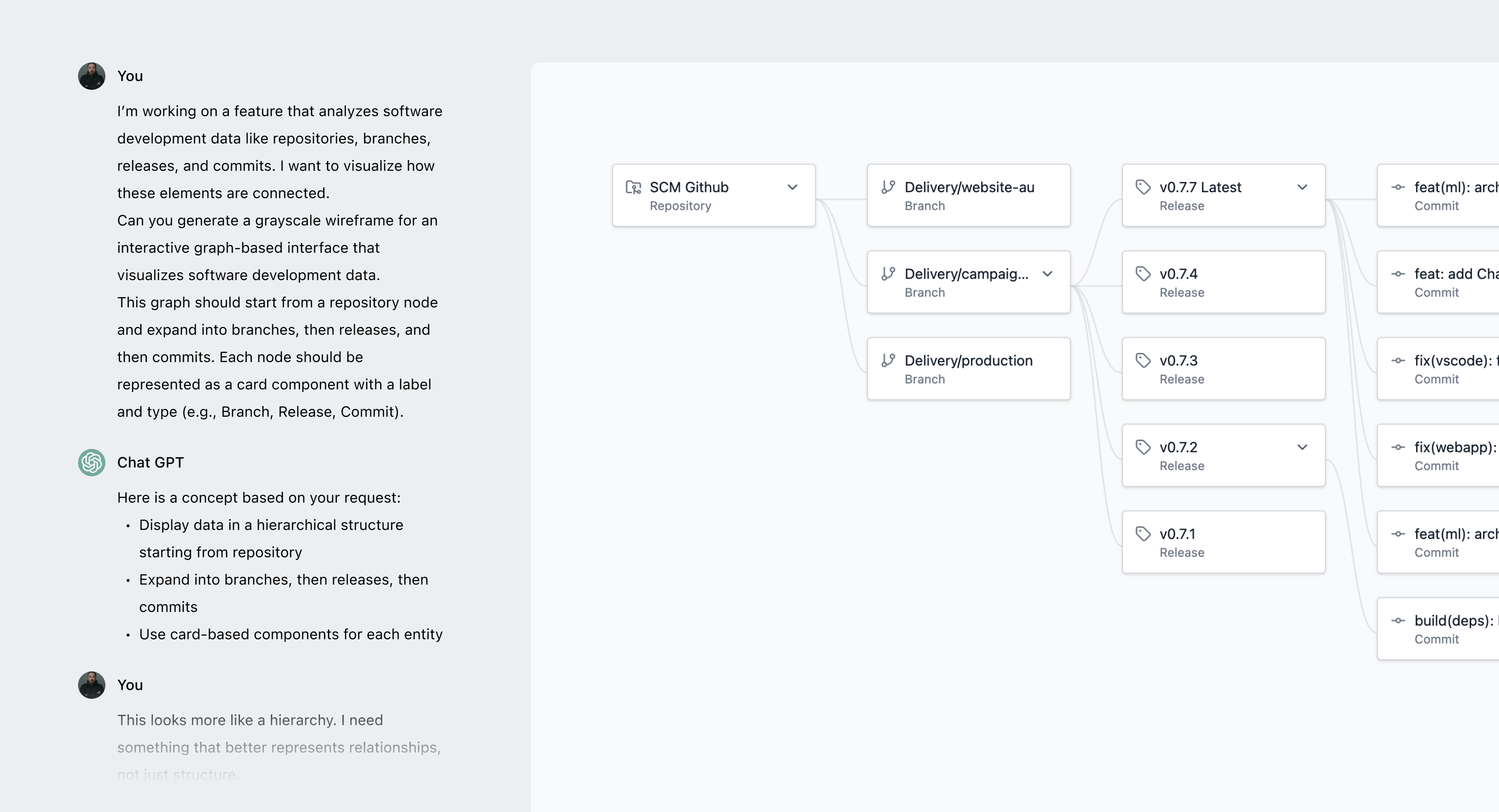
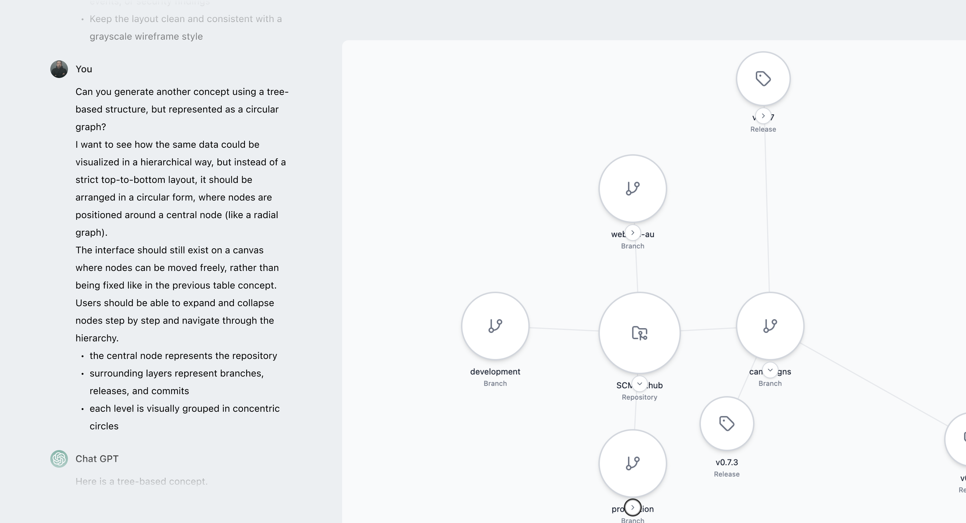
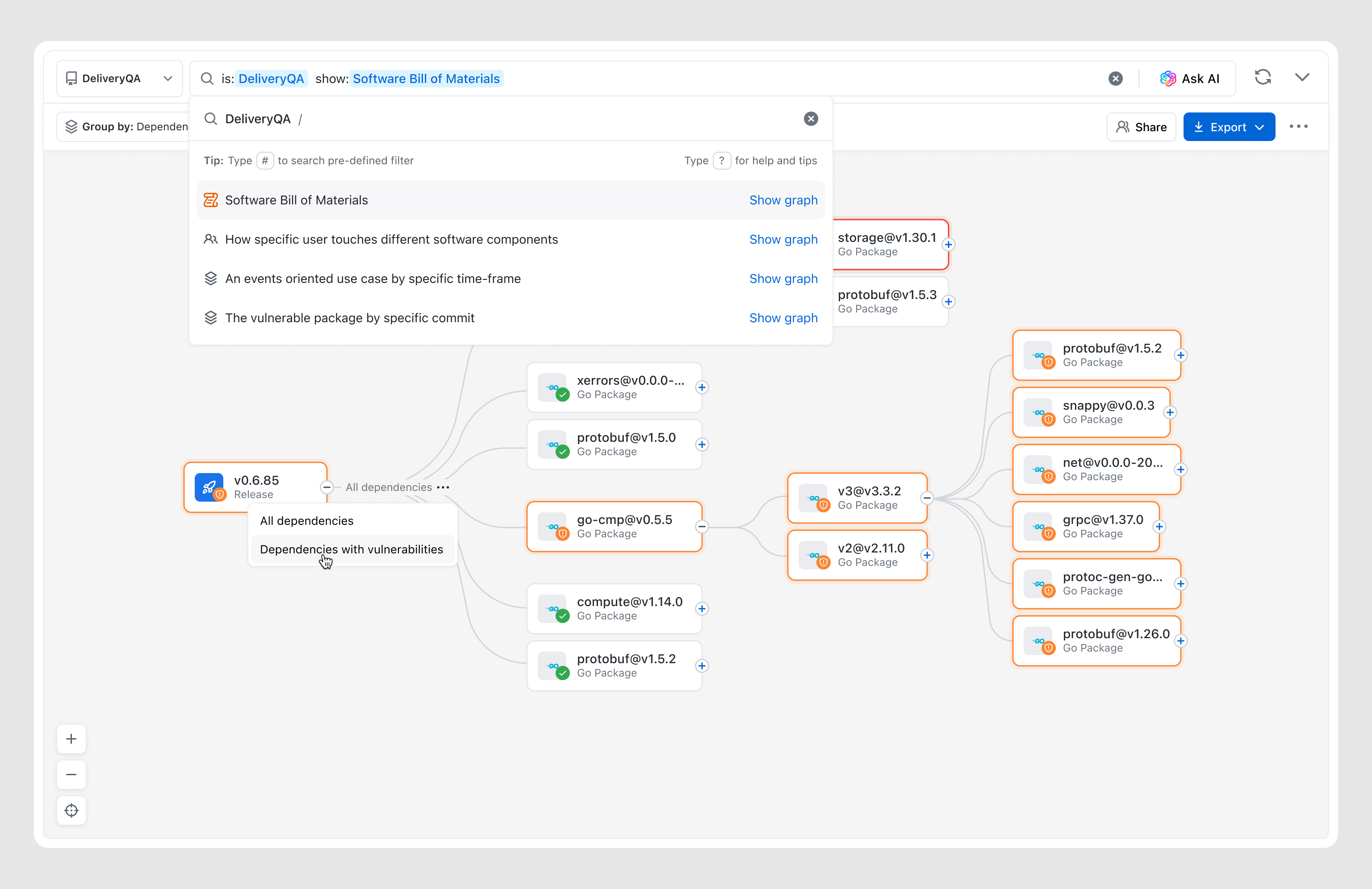
To figure out the right way to represent complex development data, I did UX research and explored existing patterns, then narrowed it down with the team to a few directions worth testing.
I used AI to speed up the process — quickly generating and iterating on ideas instead of building them from scratch, then testing them against real-world scenarios to see what works and what breaks.
Through this process, it became clear that the graph-based approach was the only one that could handle both scale and complex relationships in a meaningful way.
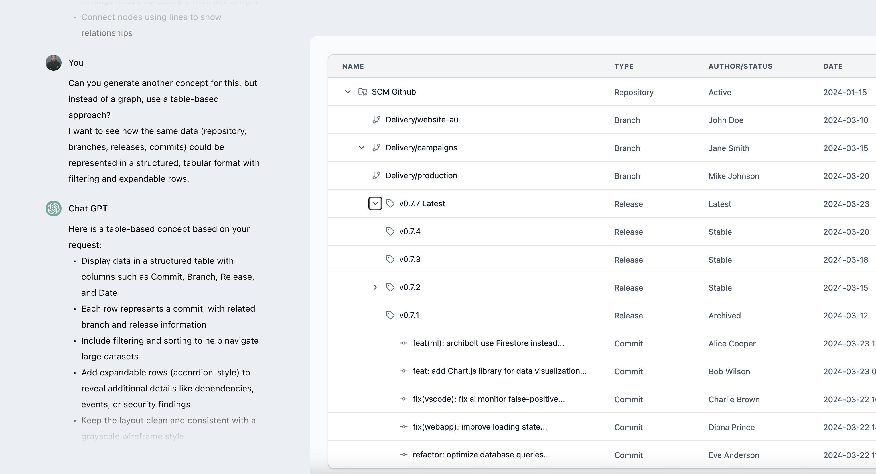
While the table is the most efficient way to scan data, it breaks down when it comes to understanding relationships, forcing users to track connections mentally.
Circular graphs work for small datasets but break down at scale, becoming dense and making relationships hard to follow.
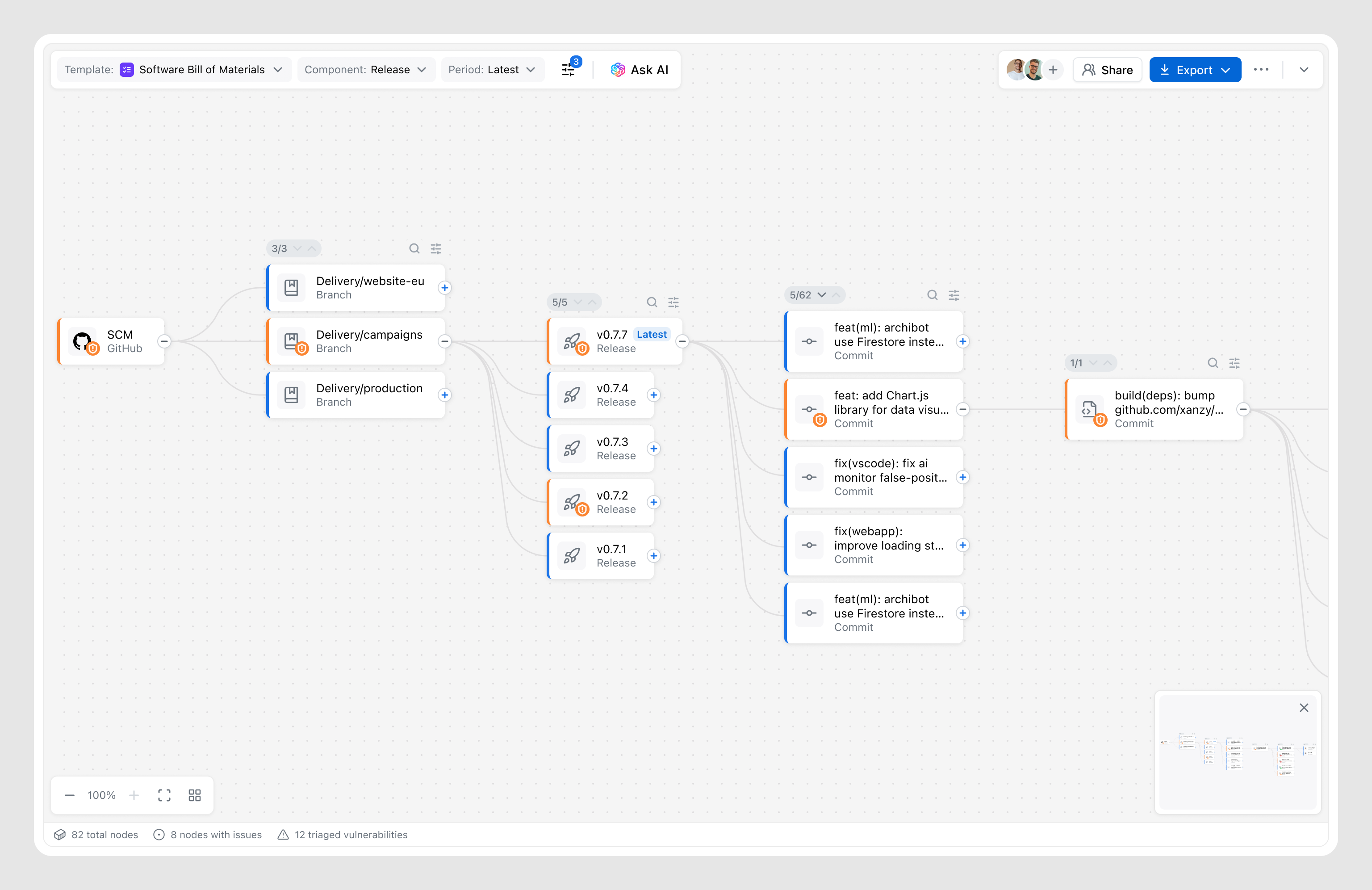
In complex systems like security lineage or dependency analysis tools, linear graph are a familiar way to represent relationships, reducing the learning curve.
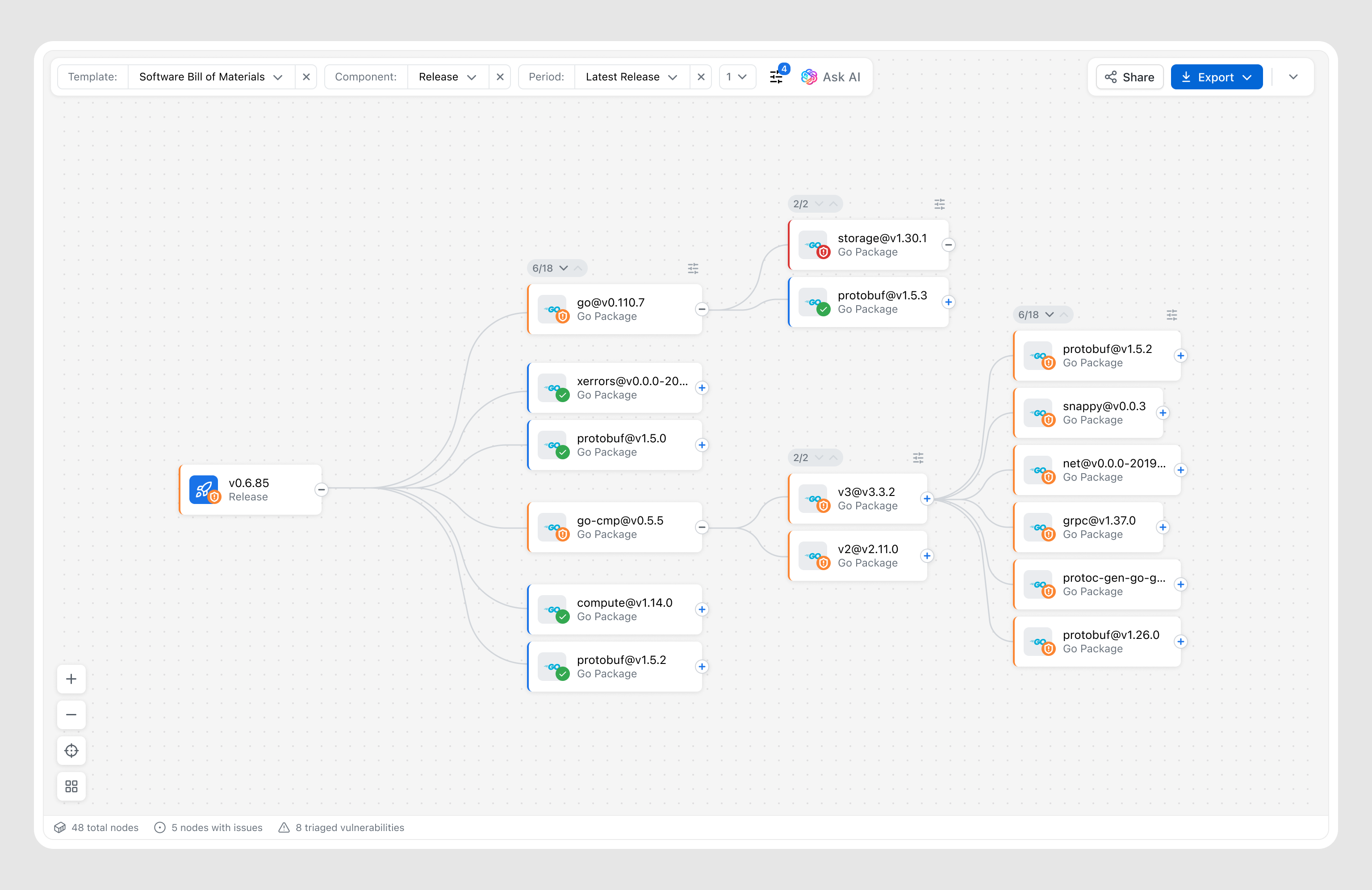
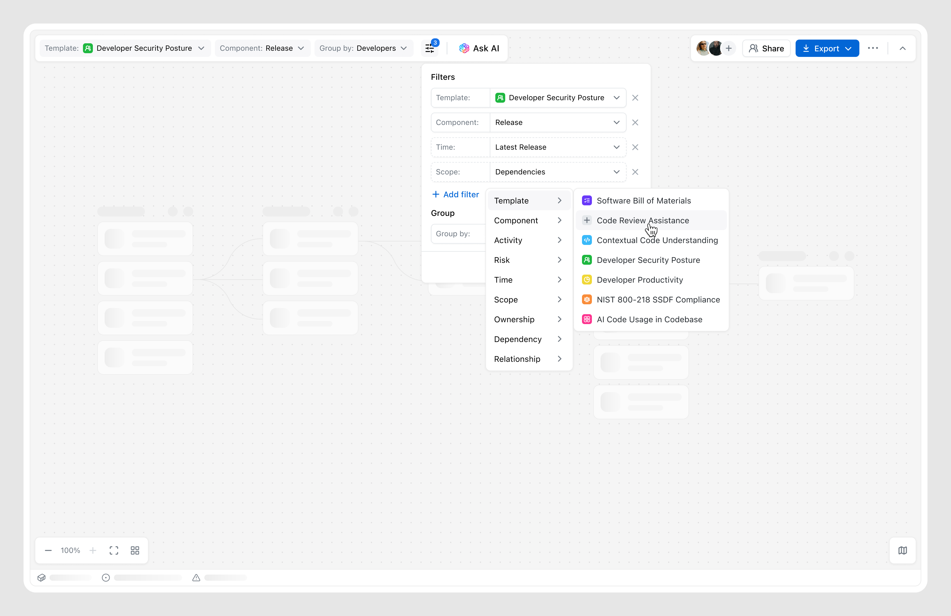
Early concepts focused on balancing structure and flexibility. As the designs evolved, scalability became a key challenge — especially around filtering and navigating the canvas. What started as simple templates evolved into more flexible filtering, adding both control and complexity.
At the same time, defining the right level of detail for nodes, along with canvas-level insights, grouping, and sorting, became critical to keeping the graph readable as it grows.
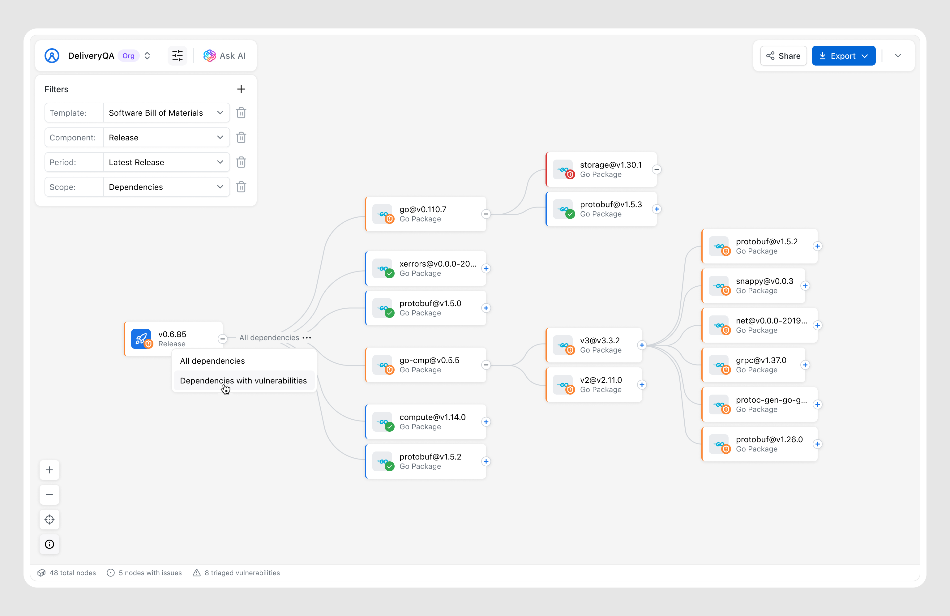
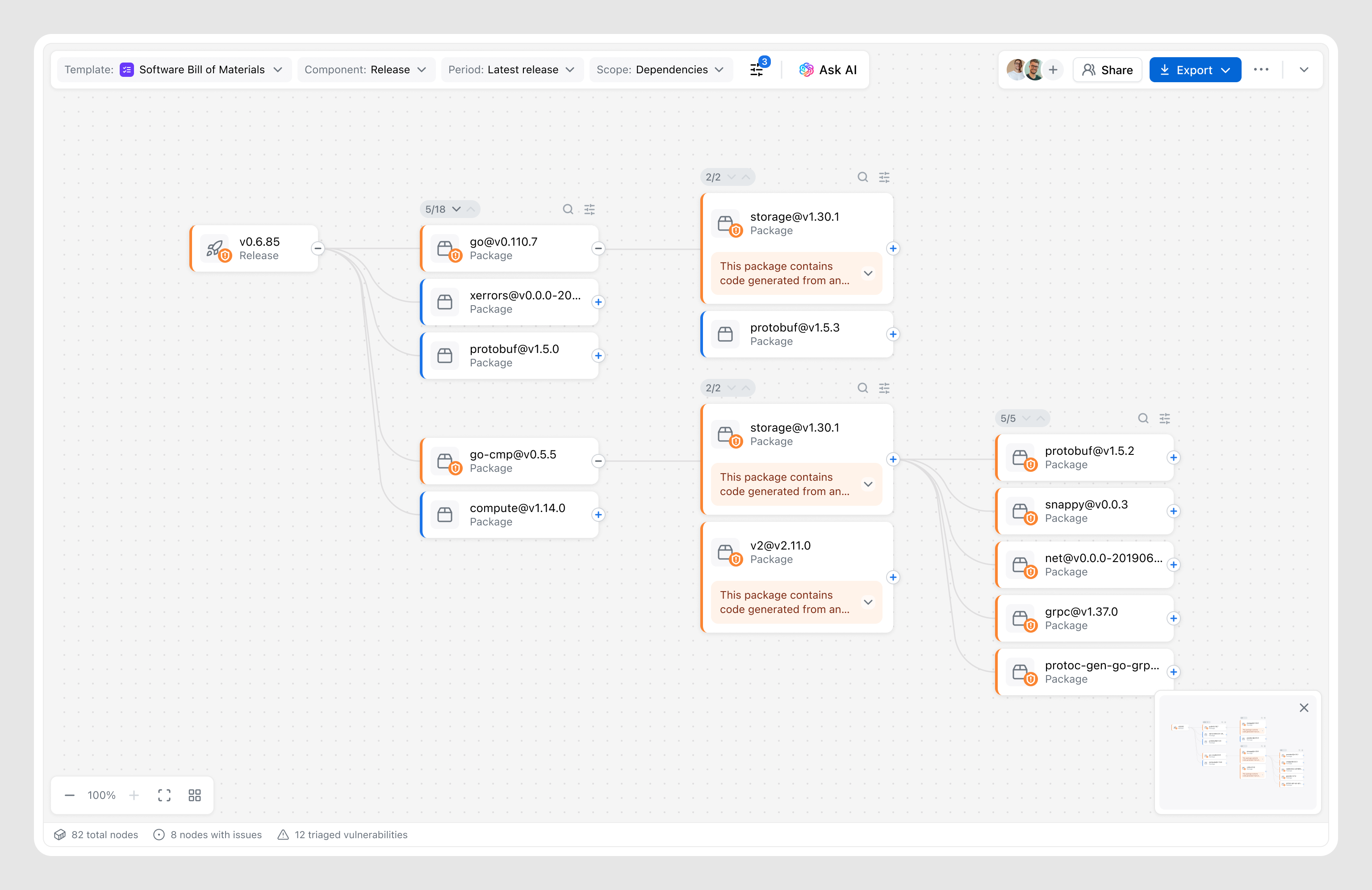
The layout ensures scalability for complex use cases while giving users full control over the canvas. It follows a “dark cabin” principle — keeping the interface quiet by default and only surfacing alerts when necessary.
Based on research insights, all controls — including filtering were designed to stay out of the way, keeping full focus on the canvas. We intentionally handed over to the system the complexity of organizing and representing nodes in the most effective way, considering many factors such as use case, data volume, etc.
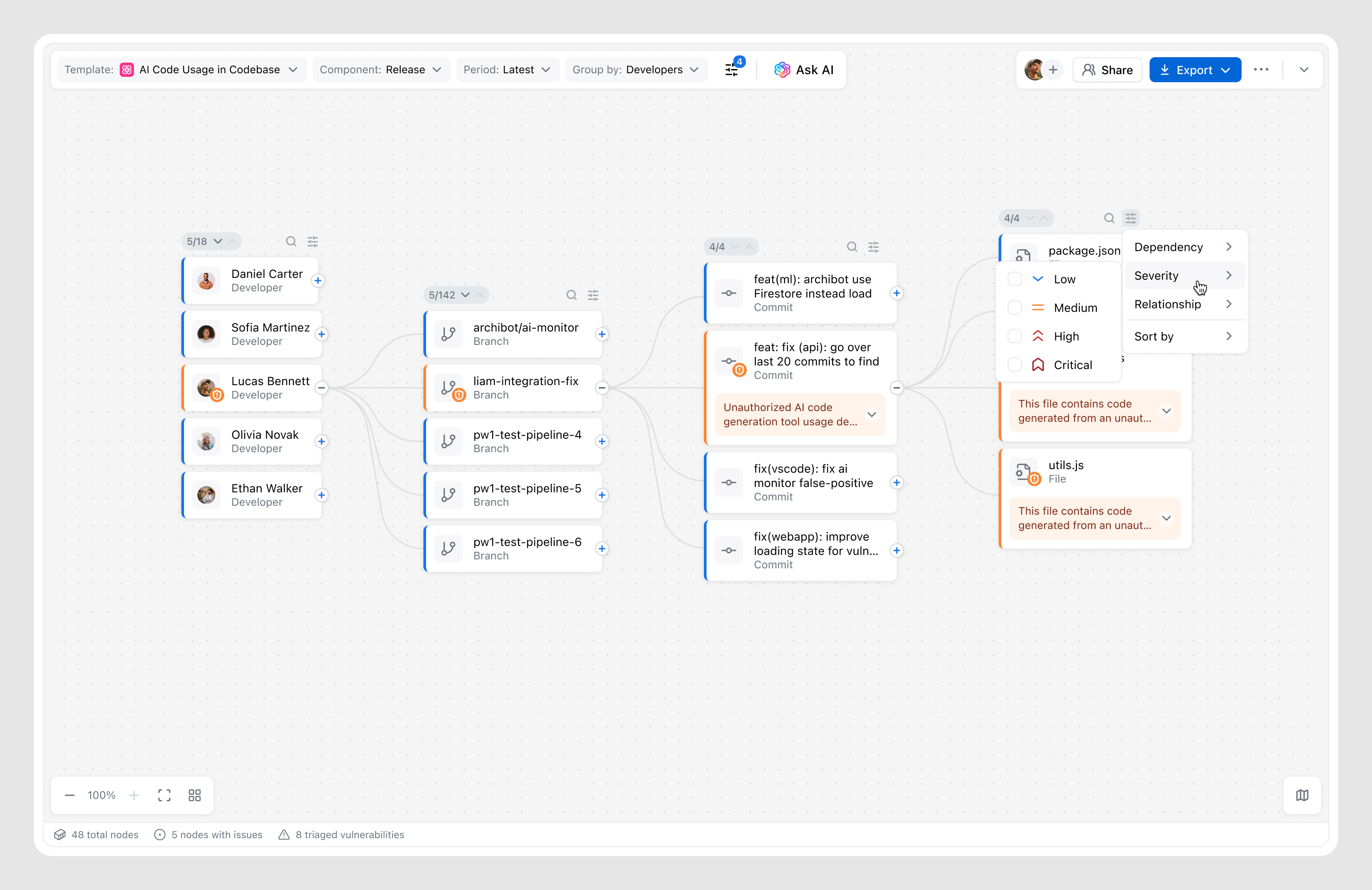
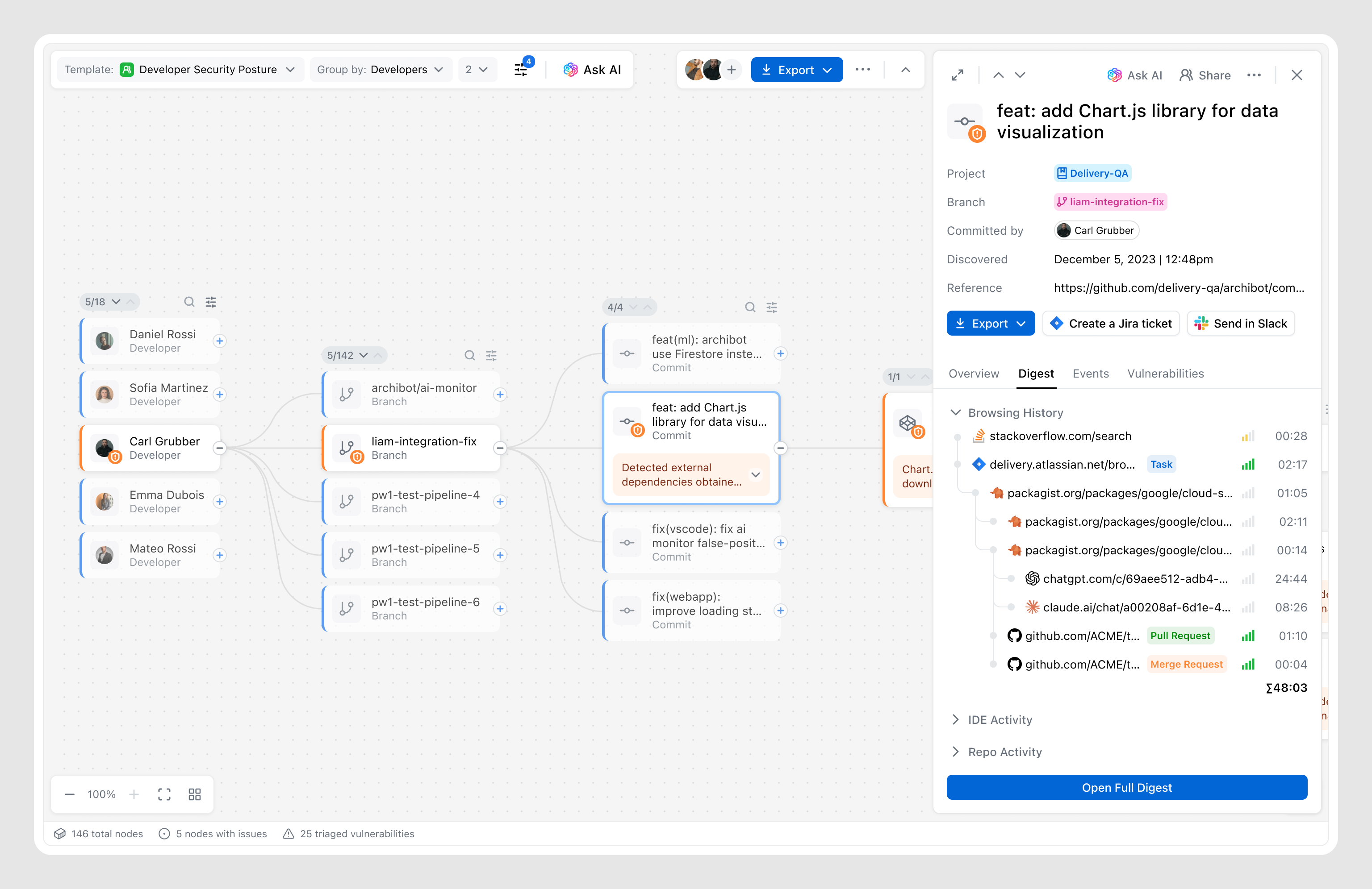
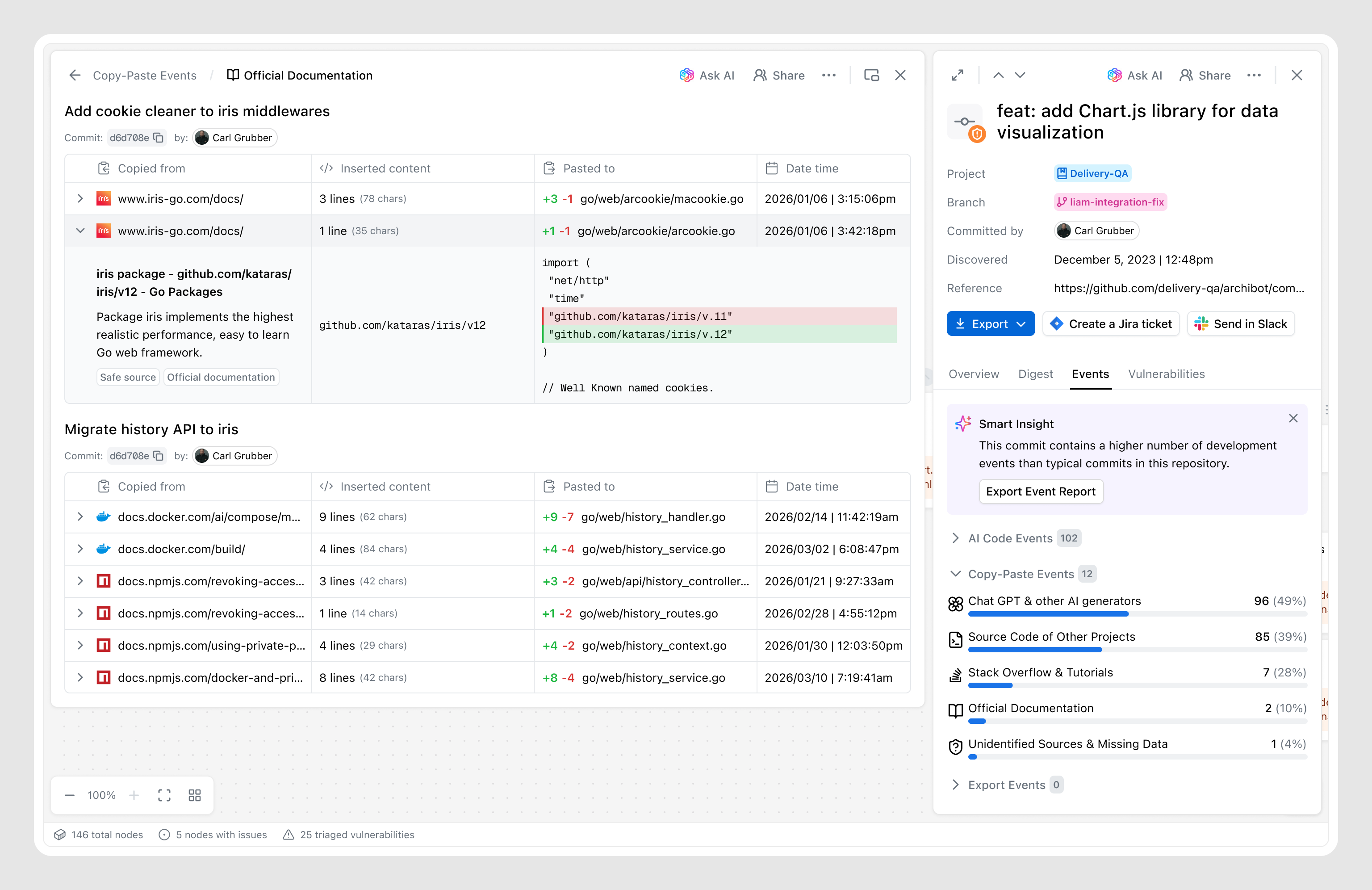
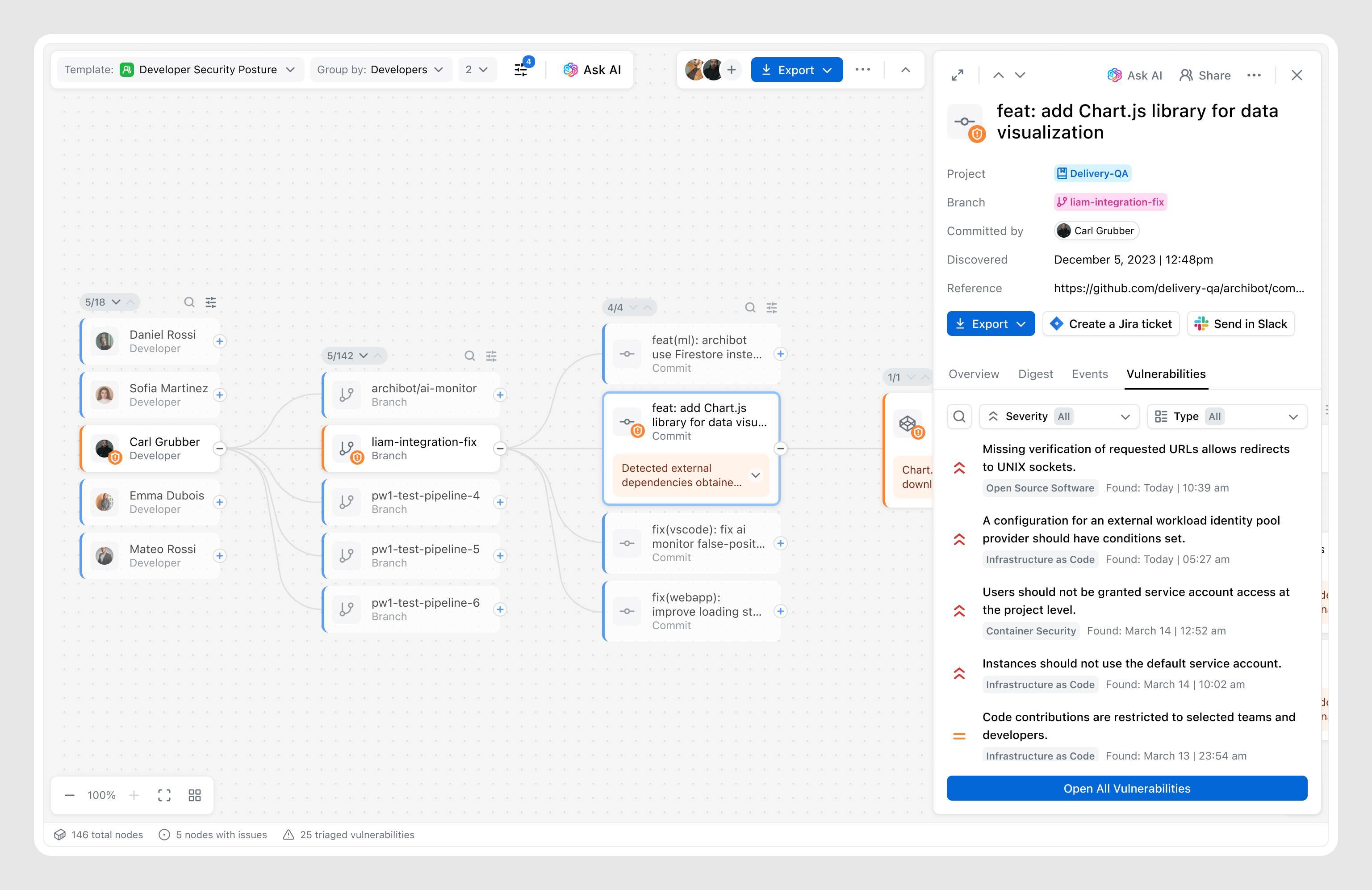
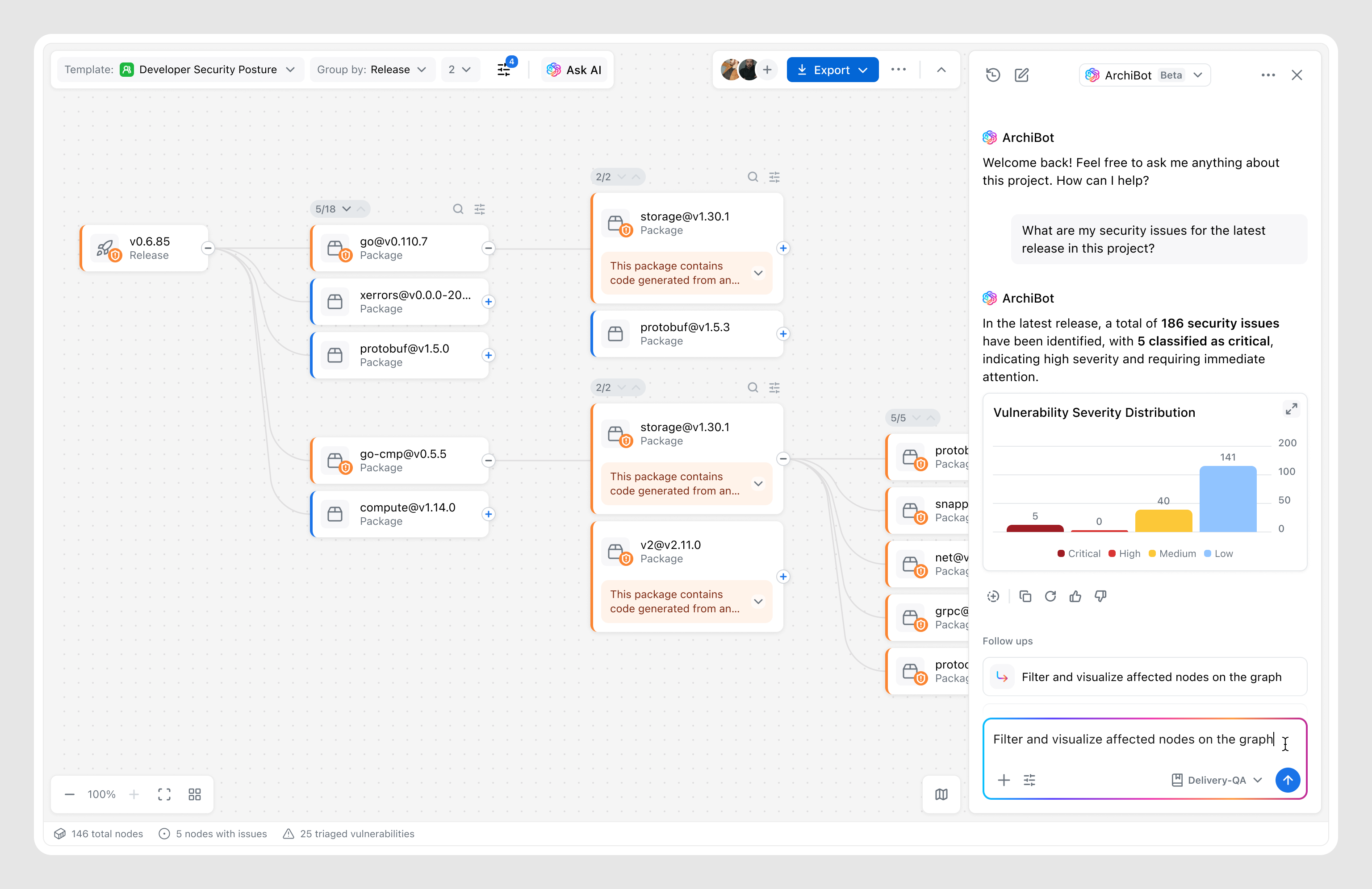
The graph canvas provides a high-level view of relationships, but deeper investigation requires a more focused layer that brings together relevant information and actions into a single space.
By learning from users, I understood what information matters and how it should be structured, while ongoing testing and a focus on personas shaped how key metadata, signals, and system insights are brought together into a structured and digestible experience.
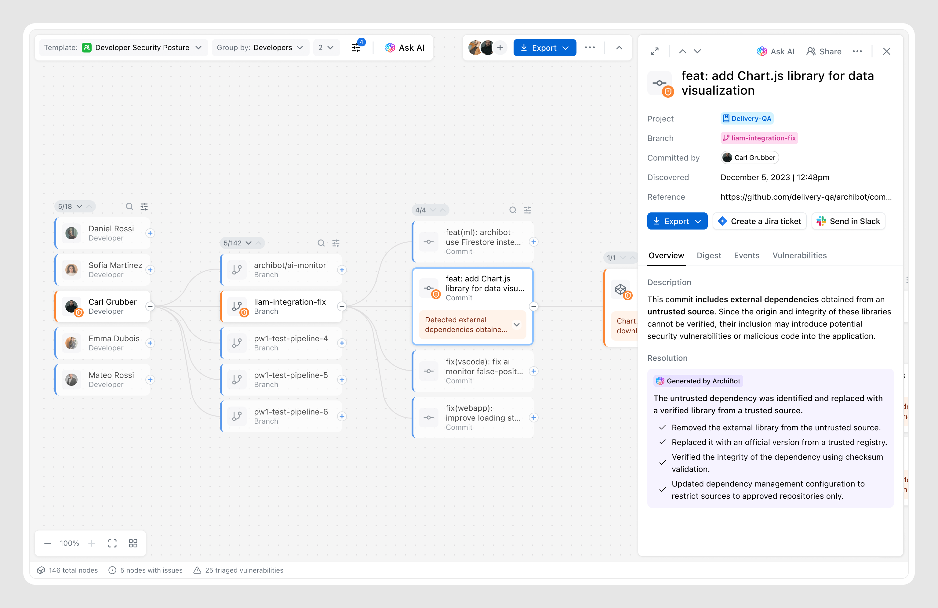
The AI assistant already existed in the product, but as a separate feature. I suggested integrating it seamlessly into the graph, allowing users to enhance manual exploration with AI — asking exact questions and getting results that dynamically adjust the canvas.
This integration allowed the Graph to become not just a visualization feature, but a step toward a unified Archipelo ecosystem, where users can both query data and investigate it with the support of existing features.
Graph sessions resulted in follow-up actions (report, task, or data export).
Users who engaged with the Graph returned weekly after first use.
Positive feedback on graph-based exploration experience.
Tone shapes product perception: Early internal testing showed that labels like “Who introduced the bug” created friction among engineering teams, who perceived the tool as a “blame tool.” Shifting tone toward remediation and context instead of culpability changed how the tool was perceived overall.
The performance trade-off: Initial concepts for large-scale graphs were approved by all stakeholders but proved impossible to scale efficiently across millions of commits. Collaborating with Engineering led to progressive loading and summary nodes — reinforcing that a “perfect” UI with 10-sec load time is a failed experience.
High engagement doesn’t equal value: Early testing showed high engagement, but most users were “playing” with the graph while overlooking next steps. I realized actions lacked emphasis, so I reworked the details view to prioritize remediation, turning exploration into resolution and leading to a 74% action rate.
Feature designed for specific targets shouldn’t exclude others: We initially designed the Graph as a retention play to prevent Engineering Managers and Security Analysts from switching to third-party investigation tools. But release revealed a unexpected audience — DevOps leads who used the Graph as a high-level "map" to coordinate fixes. By introducing a visual model of the codebase, the Graph lowered the barrier to entry—transforming a niche investigative feature into a cross-functional collaboration tool.